Saturday, March 29, 2014

Back to thinking about canal houses

Several years ago while taking Elizabeth Barton’s Series class as QU I drew out a canal houses sketch from a photo taken in Amsterdam.

final
This was my original sketch. At the time I was thinking of doing this in blues, browns, and oranges and I used watercolors to try out that idea.


More recently I have been debating about making this a night time scene and only have one set of windows lit up to make that the focal point. The idea here was to make you wonder what time of the night it was since all the other windows were dark and to make you wonder what was happening in the one with the windows that were lit up.

Canal houses I drew it out a long while ago in EQ to test out fabric choices and decided to get it out to play with again with the nighttime theme. Boy am I really liking EQ to try out fabric ideas.


Does this make you wonder about what is going on in that 3rd floor apartment? Are they getting home really late or are they getting up really early for work? Are they having a late night party? Are they getting up with a sick child?

This might work out if EB gives us a focal point lesson.


My line quilt is starting to grow on me. I pinned it to another quilt that is hanging on a narrow wall in my upstairs hallway just to see how it looks there.  The quilt that is already there is a small patchwork quilt that I won years ago at a local quilt show. I am beginning to think that this might be the place to hang the new quilt.


Between the Shadows

I did offer the quilt to my daughter for her apartment, but she is pretty picky. I will let it hang there pinned to the other quilt for a while to see if that is where it belongs. On the other wall in the hallway is my cardinal quilt. The two quilts do go together nicely…one realistic and one abstract.

Midwinter Visitor

Thanks for reading. Now to check out your blogs.
Chris

Friday, March 28, 2014

Feedback on “Between the Shadows”

I decided on “Between the Shadows” as the title of my line quilt.

Five of us got feedback on EB’s blog this morning.
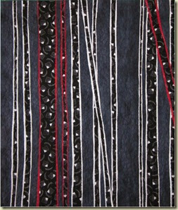
My feedback from EB is below. I am Student #4. We are anonymous on her blog.


“I think this came out very well...the lines are beautifully skinny!!  and not boring at all.  I like it that you left some fairly significant negative spaces too which helps to give a sense of depth.  and the two diagonal lines add some variety and a little mystery to it.  Well done.
Here are student 4's comments:". It came out 16 by 20. I did facing for the first time. I still like sewing on binding better. I guess I will get used to sewing facings.
(EB: it's good to try it, but if you prefer the other method, then use it.  Never feel that you have to get used to something when you've something else perfectly legitimate that you prefer.)

It’s OK, but not great. I might like my original quilt more! I think overall I like to do representational quilts more than I like doing abstract ones.
(EB: but you did try, and that's good - now you know you can!)
I think I would have preferred making a line quilt from scratch rather than from a quilt that I already made. I would have rather done something  like the lines created by a fire escape, telephone lines, a sailing ship riggings, or a suspension bridge.I think those would have been more interesting.
EB: All good  very good ideas...I would make a note of them for when you have some extra time)”


So the quilt came out “very well.” That reminds me of lines from Pride and Prejudice which is one of my favorite books.

Elizabeth Bennet: What a beautiful pianoforte.
Georgiana Darcy: My brother gave it to me. He shouldn't have.
Mr. Darcy: Yes, I should've.
Georgiana Darcy: Oh, very well then.
Mr. Darcy: Easily persuaded, is she not?
Elizabeth Bennet: Your unfortunate brother once had to put up with my playing for a whole evening.
Georgiana Darcy: But he says you play so well.
Elizabeth Bennet: Then he has perjured himself most profoundly.
Mr. Darcy: No I said, "played quite well."
Elizabeth Bennet: Oh, "quite well" is not "very well." I'm satisfied.

So I am satisfied with this finish. I did step out of my comfort zone in two ways. First, by making something more abstract and second by sewing facing instead of binding.

All  the dark negative space led to the title of the quilt (Between the Shadows). In June or July we will not have a lesson and will have to make a quilt on our own. It can be from one of the sketches or ideas that we did not use in a previous lesson. I have a couple thoughts on that.

I could make the scene from Edinburgh after editing it based on the feedback from EB.
edinburgh sketch

I could make the tree showing movement also after editing it.
Feb_CS_sketch3
Or I could create another line quilt from scratch for the ideas that I had. I guess I will see how I feel when that time arrives. Right now I am leaning toward something with lines, but that could change before then. One good thing about this class is that we have to generate several ideas which can certainly be used later. Meanwhile I look forward to the lesson for April.


Thanks for reading and for all your support.
Chris

Thursday, March 27, 2014

Give me a real tree any day…

Well I finished the line quilt and am not too sure about it. It’s OK, but not great. Or maybe I am just beating myself up?

I think I would have preferred making a line quilt from scratch rather than from a quilt that I already made. Or maybe I just picked the wrong quilt to make this one from for the lesson. I would have rather done something with lines like those created by a fire escape, telephone lines, a sailing ship riggings, or a suspension bridge.I think those would have been more fun. At least this was a challenge.

I had such a hard time picking fabrics and a color scheme for this one so that must say something. I think at least I did a good job of that. And I did get to practice free motion quilting and putting a facing on a quilt for the first time. I still like sewing on binding better! This one was hard because of the thickness of the fusible web at the edges of the quilt especially the right hand side. That could always be an issue for me since I do a lot of fusible. I guess it will get easier with time and practice.

So here is the original quilt called California Dreaming.

california dreaming2

Here is my remade line quilt from the trees in the background.


Not sure what I should call this quilt. It came out 16 in by 20 in.  Any ideas for a title?
  • California Dreaming 2?
  • The Dark Woods?
  • Between the Shadows?
  • Ancient Pines?
  • Give Me a Real Tree Any Day? 
Just being silly with the last one! I hate to say it, but I might like the original quilt better than the remake. Sorry, EB.

Linking to Nina-Maries Off the Wall Fridays.

Thanks for reading and for your comments.
Chris

Thursday, March 20, 2014

Submission, feedback, slight adjustment

I thank all of you that gave me feedback on my last blog. I decided to go with a black, white and red theme based on the feedback. I worked really hard on the quilt today because the deadline to submit the blocked out quilt was by midnight tonight.

If you recall this was my sketch. We had to make a quilt that we made before and turn it into a line quilt. I blogged about it here.

Mar_CS_sketch3
I played with colors in Photoshop as well as Electric Quilt and came up with this quilt to submit to Elizabeth Barton. Electric Quilt was a big help in choosing the kinds of fabrics to use.

The size of the quilt is 16 in by 20 in. This was dictated by the black and white fabric amount that I had.


This was EB feedback:

“This little beauty is 16" by 20".  I very much like the fabric choices...introducing the black with the white figures was an excellent idea...the widths of all the strips and the colours all look fine.  I'm just not sure about the one red diagonal  - are we getting an idea of the strips blowing upwards in the wind??  I think it might work better if it parallels the other much more subtle diagonal...which would relate it better to the rest of the quilt...also you could push the outward movement slightly more on the bottom of the black/white one that is beginning to head off in a wayward direction....

so pulling it together a little more - creating just a tad more unity...and make that one strip less of a stra (what is a stra?) and more part of the whole.  Otherwise, great!!!”

So I adjusted the angle of the red diagonal. Do you think this looks better? I think it does. Funny EB did not notice that “weird” angle in the original sketch. I guess sometime it does not show itself until you do it in fabric. Was there something else I missed in terms of unity and pulling it together more?


I did not notice this issue with the red diagonal at all. Once again I was creating the sketch from the actual angles of the trees in the original quilt. Another lesson learned.

Another thing I have been doing lately is using Totally Stable fusible tear away stabilizer to create my pattern pieces. It is thin enough to trace the pieces without using a light box. I iron misty fuse onto the back of the fabric piece and then iron the totally stable pattern pieces onto the front of the fabric and cut out the pieces. It went very fast and was much easier than using freezer paper.

Thanks for reading and feel free to comment.

Linking to Nina-Marie's Off the Wall Fridays http://ninamariesayre.blogspot.com/

Chris

Tuesday, March 18, 2014

Need Help

Have you ever worked on something and start to get desperate because it seems that nothing is working?

That's how I feel about our line project for the EB master class. No matter what color scheme I choose it does not seem to work. I lay out fabrics on my design wall and am not happy with anything I have tried.

I am tempted to go with a black and white color scheme. I am at school so I will have to show you what I am thinking in Photoshop instead of in fabric. You will have to forgive my Photoshop paint bucket filling. Sometimes it fills more than I want it to.

Of all the colors I tried I like this the best. Blue (royal blue?)/black/white-gray. But when I put this on the wall in fabric I am not sure. Of course in fabric I lay out the background and one stripe. Maybe I need to lay out the whole thing to see what it looks like. But I don't want to go through all of that work if I am not going to like it.


If I go with black/white/gray here are some ideas.


I even thought about making everything black except for the white lines outlining the tree shapes.


Or some combination of the white lines and some gray trees.


I am not even sure at this point if I want to create this in the more vertical format or the more horizontal format.

I am almost at the point of not wanting to do this at all. What do you think? Would you go vertical or horizontal with the layout? EB thought long vertical format was a stronger design. I am not sure.

Thanks for reading. Chris

Thursday, March 6, 2014

To bind or not to bind that is the question

I have to decide whether to do a facing or a binding on my windmill quilt. I usually like the look of a binding so have never done a facing. Also the quilts that I see faced often do not have very square corners which is one of the reasons I don’t like that technique.  Also I feel more comfortable doing a binding since that is what I have done and have gotten good at. But the trend these days for art quilts is to do a facing.
If I do decide to face this quilt I think I will use Terry Aske’s directions on her blog. This may be less bulky as well as creating better corners.

What do you think? Here are 2 pictures of the quilt. One without binding and one with 1/4 inch binding. I just cut fabric 1/4 inch wide and laid it down on the quilt to see how that would look.


On Monday I did some more snow dyeing (although it was more like crushed ice dyeing). I used 2 purples (plum and blue violet). I used white fabric on top of a grid and put on the snow and powdered dyes. This time I had a piece of unbleached muslin under the grid to catch the dye drips as the snow melted. Both pieces came out great. Nice patterns. What is interesting is how different they look in terms of the purple color. I see the unbleached muslin piece as a stormy night sky with lightning going on.


I sent my sketches off to Elizabeth Barton for our March lesson on line. We are supposed to remake a quilt that we have already done with the emphasis on lines instead of shapes.

Here is my original quilt that I call “California Dreaming.” It is a very small quilt at only about 10 in by 12 in.

california dreaming
I decided to focus on the trees in the background since they seem to be lines in my mind. These are my 3 sketches of the trees.
Mar_CS_sketch1
Mar_CS_sketch2Mar_CS_sketch3
Now that I see them posted I am not sure I like these at all. They were fun to do, but I am just not sure.
Here is what EB said about them, “I like all of these ideas - student 9 has been careful to vary both positive and negative space which makes these very interesting - and I love the very narrow dark line that edges the medium value.  I know she's going to say - oh that was just the drawn line!! BUT when we look at the sketches that is what we see and that's what's adding to their beauty - that very very narrow linear element - so don't then go and omit it when you make the quilt!! Because then you'd wonder why the quilt didn't have the elegance of the drawing.  I think all of these work, but probably the first and third are stronger, in that the overall shape of the second one is a little more predictable.  You could increase the four patch to a nine patch too - or do a row of patches changing orientation.  What makes all of them is the negative space variation.  All are so much more painterly and much stronger than the original which is basically a photograph rendered into fabric - nice enough as it is, but nothing special.”

So EB liked the drawings! Why can’t I get the confidence to see what she sees before I send them to her? I liked them to begin with and then I started to doubt them. Maybe I need to go with my first instincts and forget about the doubts? But sometimes something bugs you about a quilt and you do have to change it. When do you know when to go with it and when to change it? I guess that will always be hard for me to answer.

Do you have a lot of confidence in your work or do you still have self doubts? If you are confident were you always that way or did you work through that?

I am linking early to Off the Wall Friday. I will be on the road tomorrow and not able to blog.

Thanks for reading and commenting.

Chris