Friday, August 29, 2014

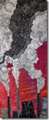
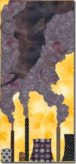
“A New Dawn?” is done

Well almost….still have to face it. Maybe I will get to that this afternoon.

The title came from a friend that I had back in grad school in the 1970’s. I just recently reconnected with him on Facebook. We were both physics majors at Arizona State University. Other wonderful titles were suggested to me as well. Thanks for all those suggestions.

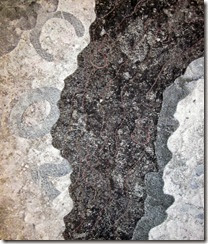
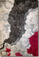
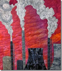
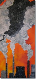
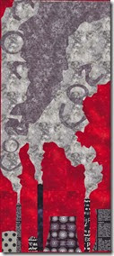
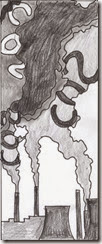
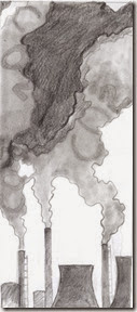
I think I accomplished my goals with this quilt. The finished size is 11 in wide by 27 inches tall. The smoke from the coal stacks takes up most of the space in the quilt which is what I wanted to emphasize. The sky is pretty in contrast to the smoke and pollution.  In fact here is a physics lesson for you….Particles of pollution in the air actually make a sunrise and sunset prettier. The Sun’s light scatters off of these particles making a more beautiful and colorful sky.


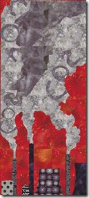
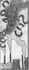
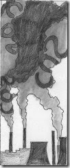
The CO2 letters in the lighter smoke are subtle as is the CO2 that I quilted in the dark smoke.


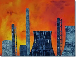
Some other close ups.

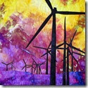
I am thinking that maybe I should display this quilt next to my windmill quilt from February. Fossil fuel usage vs. renewable wind energy. They both have dramatic skies!


Thanks for reading and commenting. Love your comments.

Linking to Nina-Marie. She has been doing her off the wall Fridays for 2 years now.

Chris

On a different note: Started my last semester of teaching yesterday. Retirement in December!

Also I got my feedback from EB right after I sent my photos in to her an hour ago. Here is her feedback.

I very much like the subtlety of the letters - at first you are drawn in by the beautiful sky and the interesting shapes that the smoke makes - but the closer you get the more you realize that this is not good, this is pollution and you are going right into it and it's taking over.  Well done, student 4 - you've used the letters to create a clear message but done it in a way that engages the viewer completely.
And this quilt does compare and contrast very interestingly with your February windmill quilt...so I hope that the assignments to come will further the series!!  I think September should be a possibility!
Wednesday, August 20, 2014

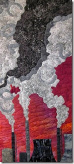
Revised blocked quilt

Well I searched my stash for a darker and more grayed sky fabric after EB’s comments. I came up with a hand dyed piece of fabric that I bought from Gloria Loughman when I took a class with her 2 years ago.

Hopefully the face is a thing of the past, but I find that if I stare at the picture long enough I can see all kinds of faces! Its just like looking at cumulus clouds. I have no problems finding animals and faces in the clouds.

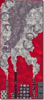
Here is the revised quilt. I just sent it off to EB for feedback. Now I need to work on a title….

  “Burning Fossil Fuels”

  “Climate Change”

  “21st Century Challenges”

  “The Pool of Truth”

  “What a Pretty Sunset”

  “Are Humans Smarter than Frogs in a Pot?”

?????? something really clever?

Any ideas for a title?


We are heading out later to Delaware so I am linking to Nina-Marie today. I wonder how her letters are going.

Thanks for reading.

Chris

Tuesday, August 19, 2014

Feedback already…Yikes

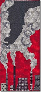
All that thought about the sky and it was a something E was not crazy about. Here’s the blocked quilt and what she said.

I think this works very well and the CO2 in the clouds is nicely subtle - it's always good to have something for the viewer to "discover"...I would make a couple of minor adjustments, that's all:
1.  you have a profile of a guy with a sharp nose on the top left hand of the darkest cloud and once you see that...you see nothing else!!!...
2.  The red fabric looks a little flat somehow next to the  clouds...I know you said it's sky but being lighter, warmer and more saturated it's advancing...and so I read it as flames rather than sky....perhaps adding a little white here and there to the smoke??  another possibility would be to have it more graduated in color..I like the yellow down near the smoke stacks by the way.  The sky is lightest near the horizon .
Don't think you need the two red bits at the top...either more than that or less than that.
So a little adjustment of the edges so that there are no profiles - unless this is a    silhouette of the Great Polluting Oligarch himself!!
And a little fiddling  around to push the sky back a bit more....
and it will be perfect!!  Good one!!  And of course I definitely am in agreement with the message.

Wow I did not even notice the face profile at all. Now that she mentioned it I do see it. That is an easy fix. Now to look for a different sky fabric. At least she did not think the black smoke was too dark which is what I was worried about. All the other things I did not see at all. More learning to do.

Thanks for reading.

Chris

Submitted my blocked quilt…awaiting feedback from EB

Well I wrapped up the blocked quilt today and sent it off to EB for feedback. The thing I am not sure of is if the darkest smoke is too dark. I decided to get her thoughts before taking it out and cutting something else.

Here is the blocked quilt. Do you think the dark smoke is too dark?


Thanks for reading. Now to clean the sewing space. Looks like a bomb hit it.

Chris

Monday, August 18, 2014

Stacks done…onto the smoke

I tried painting a piece of fabric for my red orange sky this morning, but it did not come out as I hoped. So I decided to shrink my pattern a bit to get it to fit on the piece that I painted last year.

I worked on the stacks and cooling towers. I decide not to use what my daughter called comical fabrics for the stacks. I went with a mix of blacks and dark grays. This is just the bottom part of the quilt. Will post again when I have the smoke done.

The cable guy just left. We are not getting a channel that we are supposed to be getting. Weird that it is just one channel. He could not figure out the problem on our end. Looks like it is going to be escalated up to the next level. Probably a coding error I am thinking, but what would I know? Gotta love Comcast.

Thanks for reading.

Chris

Friday, August 15, 2014

When do you settle?

What if you don’t have the fabric that you need for a quilt? What do you do? There are only a few choices as far as I can see.

  1. Look through your stash for the 100th time hoping that somehow it it there even though you know it won’t be.
  2. Go to the quilt store hoping they have it.
  3. Look online hoping that what you are seeing on your monitor is what the fabric actually looks like. Of course this is really not a good idea since you don’t have the time to wait for a fabric to be shipped to you anyways.
  4. Try to dye or paint fabric to create what you need even though you know that that most likely will not work.
  5. Settle for what you do have in your stash.

I am at that point. My daughter gave me feedback as to what sky looked the best for my global warming quilt in EQ (Electric Quilt) and of course she picked the one with the sky fabric that I do not have. I guess that is one of the dangers of EQ. The fabric looks great in your quilt design, but you don’t have that fabric.

global warming

She picked the one with the dark red orange sky. Her only comment was that she was not sure the stacks should be done in frivolous fabrics like dots for such a serious topic. I did not really have dots to work with anyways. But my thoughts were to make the stacks sort of friendly and harmless looking which is in stark contrast to the plumes coming out of them. Maybe I will have to rethink this. The plumes of pollution are the major part of the quilt. The quilt is very long and skinny at 12 in by 29 in.


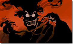
My daughter said it reminded her of the smoke monster in a movie she watched as a kid called Ferngully. It was an animated film about saving the rain forest. Robin Williams was a voice of one of the characters in the movie. I remember how she was scared of the monster in this film. Of course she was pretty young when she saw it.

Wicked_Hexxus


global warming2

So what do I do about the red orange fabric? I guess I will do all 5 of the things above. I guess by the time I get to 5 I will be settling for a red sky which I do have. But I sure wish I had the red orange.


Linking to NIna-Marie.

Thanks for reading and commenting about what you do when you don’t have the fabric you need for a quilt. Should I just settle for the red?

Chris

Thursday, August 14, 2014

Rethinking the sky color

Boy does the brain never shut down? Ever since I posted the yellow sky on Monday I have been rethinking it. Thank goodness for EQ so you can try things with a click instead of cutting out fabric.

I am now thinking of a dark red sky. I also like the dark orange sky, but don’t have any fabrics in my stash to match it.

Red sky (burning fossil fuels) with high contrast smoke plume.

skyfire2

Red sky with less contrast in the plume.

skyfire3

Dark orange sky

skyfire

What do you think? I don’t want to turn this into another fabric analysis like the birds!

Thanks for reading.

Chris

Monday, August 11, 2014

Letters in August (edited)

Our master class lesson for August is incorporating letters in a quilt. While driving across Pennsylvania last week to visit my dad I got the inspiration for my quilt. I saw plenty of coal stacks releasing pollution into the air. If you know me you already know that I teach meteorology and discuss the consequences of the climate change humans are creating on our planet in my classes. So smoke stacks with the chemical symbol for carbon dioxide (CO2) was my idea.

I sent these three sketches to EB for feedback. I did not have a lot of time to sketch so they were a bit rushed.

August_CS_sketch1

August_CS_sketch2

August_CS_sketch3

This was the feedback from EB.

“This is a really nice sketch - of course you know that I have done a series of industrial landscapes and the shapes are often fascinating, and the values frequently much more varied...but - with that sting in the tail of the pollution that so often is associated.
I like the idea a lot ....I think I'd be fairly discreet about the chemicals involved, also as you say it's not just CO2 - but if it's the main one that's causing climate change then it's appropriate.
Doodle columns of Cs, Columns of Os and columns of 2s - I think that might  be more attractive and less "added on".  I would also vary the height of the chimneys a little bit and have the smoke coming out of all of them  and probably just have chimneys and not the "cityscape" which is a very different shape and stops rather suddenly behind the cooling tower - these are all just minor adjustment by the way!!! and I'd keep the contrast between the letter and the cloud very low..so it's not completely evident at first.
Very interesting idea - and again completely different from anything else in the class!!! wonderful!”

I understand most of it. Not sure about the doodling of column’s of Cs, Os, and 2s. Not really sure what she meant by that. I did send her an email to clarify this. Not sure if I was just supposed to thread sketch them or what. And vertical columns?

I do get that the letters should be less in your face and that my scenery at the bottom needs some tweaking.

August_CS_sketch4

This morning I did some work revising the sketch and have come up with this as I await and answer from EB. I made the letters skinnier and less obvious in the smoke and changed out the bottom stacks/buildings.


 Do you think this is better? Or do you understand the sketching columns of letters comment from EB?

Thanks for reading. Now off to start thinking about fabric.

Chris


Added after this blog was posted this morning

EB gave me feedback on the new sketch! She said:

 with the letters softened and the chimneys more varied - yes!!! plus great negative spaces!!!!

.

Climatechange

I have been thinking about fabrics and drew this up in EQ (very roughly) and am leaning toward a pallet of colors I have never used before. I am thinking this needs colors that are not the usual happy blue sky due to the seriousness of the topic of climate change. I am thinking a dull yellow sky with grays, black and whites, and browns.

Sunday, August 3, 2014

Feedback on "Gossip Central"


I got my feedback from EB for my bird quilt and I am pleased. She said....

think it's a lovely quilt and a great idea...you can hear the birds whistling in harmony!!  And it's fun that there are two "staves" with the sopranos and altos up top and the tenors and basses down below!  I think it's a very fun piece, and also shows the rhythm well and with the subjects being birds obviously twittering away you can imagine the melody!!  excellent choice of fabrics, especially that mottled one where you've got the black bits on their heads.  Nice spacing - everything's perfect!

So it turns out I really needed that magic fabric!  Now onto the lesson for August on incorporating lettering in a quilt. I've done that a few times in a quilt, but this still will be a challenge.  Below is my "Connected to the Moon" quilt with lettering that I made last year.

Thanks for reading. 

Chris