I kept looking at the water fabric choice in my landscape challenge all week and kept thinking that it should be darker than the fabric I picked. I was thinking that the water should be more gray and less blue since it was a gray day when the photo was taken. Also I know that I have to watch when I make landscape quilt that I don’t create too much contrast between the fabrics. I know that when making a patchwork quilt that contrast is important. In nature the shades blend more and there can be less contrast. So I stopped at the quilt store yesterday to pick another fabric for the water. I picked three different ones to try out, but the other two are too dark. I can use the other ones for trees in a future landscape quilt.
I lifted all the pieces to put the darker water fabric in place, but now I am not so sure….maybe my first one was better. I do this second guessing thing all the time. The point of this entire exercise was to get over “perfectionism”, but I guess I have not reached that point yet!
Usually I ask my daughter, but she is away at school. Right now she is probably breathing a sigh of relief since she hates it when I keep asking her questions about my fabric choices. Maybe you can give me your thoughts. Please help me!!!
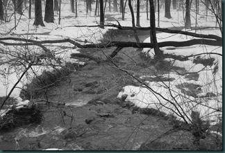
This is the black and white photo for the challenge.

This is my darker water fabric in place (some things are missing that I have to put back in place)
Now what I am going to do is post the original black and whiter photo and each of my landscape quilts turned into a black and white image. I thought this would help me sort out the value of the water and other landscape elements to see what I should do. Here goes….
Photo and first water choice
Photo and second water choice
What do you think?????? What is the better water fabric to use?
Chris


Definitely the second. You're going for a wintry feel for this piece, and the first fabric choice is more turquoise, more "summer" water. The darker color is cooler. When I looked at this piece before, I thought the water a bit off, but certainly wasn't going to say anything, but since you're ASKING...;^)
ReplyDeleteI love #2, in color and in black & white.
ReplyDeleteI think the 2nd choice has more movement in it. If that makes sense. You get more an impression of flowing water because there is more variation in the fabric itself. They both look great though so no matter what you will have a fabulous quilt when you are finished. Janet
ReplyDeleteI think the darker color looks much better!
ReplyDeleteI think the darker fabric looks much better!
ReplyDeleteI think that as it is a winter scene the darker color works better.
ReplyDeleteI would love to see this same scene does as a summer or autumn scene, with leaves on the trees, and brighter water. I is lovely Chris.
Shirley
somewhere in between -- might I suggest you check out what the BACK of each of those fabrics does for you? I have used the back of several fabrics because the color is right but the intensity is not.
ReplyDeleteI like the second choice better - it's a bit grayer as well as darker, which for a winter day is perfect. I also prefer the texture of the second one - looks a bit rougher, more like the water.
ReplyDeleteThe texture of the second one more resembles your photograph. It also suggests the cold that would be around that scene if you were actually looking at it in person. I am in awe of your talent... You've really gotten the elements down. No matter what you choose it is great. (yes, I like the darker gray with the texture in it! #1 looks more like what we saw in the caribbean a few weeks ago.) B.
ReplyDelete#1
ReplyDeleteSeeing how you do the planning for this quilt has been so interesting. Your art is just so lovely!
I like the second
ReplyDeleteThe second fabric is the better choice for the feeling you are trying to get with your quilt. It is a more "winter" water. What a great quilt. Can't wait to see it finished.
ReplyDeleteI prefer the 2nd water.
ReplyDeleteWater in streams generally isn't such a bright blue. (Altho that one is pretty) They darker, grayer one is more realistic. It's a very nice landscape.
I just took a landscape class from Joen Wolfrom. One of the big things she said was that everything in winter is usually toned. You're getting there with the second piece, but I would look for a grey with just a hint of blue. You can't see the sky in your picture, but the waterscape we did in class, the water needed to mirror the sky. When you put your second choice in B&W, it is the best - water is grey. Note that I took the class because I struggle so much with landscapes, and unfortunately did not receive a bolt of lightning with all Joen's knowledge branded in my brain. I think it's great that you are working on this.
ReplyDeleteMan Chris...that's a though one! But, I do think #2 would be the more "accurate" choice for winter and brings cohesiveness to the piece. I really like the way the "lighter" water looks, its' pretty, but it's "wrong". Does that make any sense?? I LOVE this quilt!
ReplyDeleteThe dark grey fabric more closely resembles your photo. When I see the blue river I get the impression of a sunny winter day. It's pretty with the blue, but it doesn't reflect the picture.
ReplyDelete~anna~
in the Dominican Republic