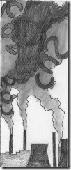
Our master class lesson for August is incorporating letters in a quilt. While driving across Pennsylvania last week to visit my dad I got the inspiration for my quilt. I saw plenty of coal stacks releasing pollution into the air. If you know me you already know that I teach meteorology and discuss the consequences of the climate change humans are creating on our planet in my classes. So smoke stacks with the chemical symbol for carbon dioxide (CO2) was my idea.
I sent these three sketches to EB for feedback. I did not have a lot of time to sketch so they were a bit rushed.
This was the feedback from EB.
“This is a really nice sketch - of course you know that I have done a series of industrial landscapes and the shapes are often fascinating, and the values frequently much more varied...but - with that sting in the tail of the pollution that so often is associated.
I like the idea a lot ....I think I'd be fairly discreet about the chemicals involved, also as you say it's not just CO2 - but if it's the main one that's causing climate change then it's appropriate.
Doodle columns of Cs, Columns of Os and columns of 2s - I think that might be more attractive and less "added on". I would also vary the height of the chimneys a little bit and have the smoke coming out of all of them and probably just have chimneys and not the "cityscape" which is a very different shape and stops rather suddenly behind the cooling tower - these are all just minor adjustment by the way!!! and I'd keep the contrast between the letter and the cloud very low..so it's not completely evident at first.
Very interesting idea - and again completely different from anything else in the class!!! wonderful!”
I understand most of it. Not sure about the doodling of column’s of Cs, Os, and 2s. Not really sure what she meant by that. I did send her an email to clarify this. Not sure if I was just supposed to thread sketch them or what. And vertical columns?
I do get that the letters should be less in your face and that my scenery at the bottom needs some tweaking.
This morning I did some work revising the sketch and have come up with this as I await and answer from EB. I made the letters skinnier and less obvious in the smoke and changed out the bottom stacks/buildings.
Do you think this is better? Or do you understand the sketching columns of letters comment from EB?
Thanks for reading. Now off to start thinking about fabric.
Chris
Added after this blog was posted this morning
EB gave me feedback on the new sketch! She said:
with the letters softened and the chimneys more varied - yes!!! plus great negative spaces!!!!
.
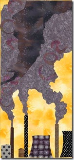
I have been thinking about fabrics and drew this up in EQ (very roughly) and am leaning toward a pallet of colors I have never used before. I am thinking this needs colors that are not the usual happy blue sky due to the seriousness of the topic of climate change. I am thinking a dull yellow sky with grays, black and whites, and browns.


A great start! I really liked the edited sketch - definitely an improvement over the first ones. I agree that a blue sky would not be appropriate for this message. I was wondering about a rusty orange - almost like what fires would do reflected against the smoke and the night sky. But a dulled yellow would similarly give the feeling that something was not right.
ReplyDelete