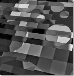
I came up with quite a few designs for abstract quilts in my class with EB.
These are my favorites:
GRAY SCALE:
BLUE GREEN PIXEL DESIGNS: I prefer the one on the right and will definitely make it someday.
PURPLE AND TEAL PIXELS WITH OVERLAY AND THEN CHOPPED.
CONVERTED TO BLUE PALLETTE: Love the colors of this one, but then blue is my favorite color. It reminds me of the darkening sky right after sunset.
CONVERTED TO A RED PALLETTE.
So my favorite technique is:
- Creating the pixels
- Putting an abstract image on top of it
- Cutting this apart and arranging the pieces.
Maybe this is something I can really expand upon. I think I have barely scratched the surface of this technique.
What do you think?
Thanks for reading.
Linking to Nina-Marie’s Off the Wall Fridays.
Chris


I agree - you really are onto something here. I'm particularly drawn now to the blue one with the curved overlay. I usually am into rigid gridlike structures, straight lines (though not necessarily true horizontal and/or vertical) but the addition of those beautiful curves over the pixelation is quite compelling.
ReplyDeleteThanks, Sheila. I think this works for me so well because it is a series of steps just like a science experiment. It is certainly something I connected to.
ReplyDeleteReally interesting!
ReplyDeleteI hadn't thought of that. I've decided I like playing that way at times because it appeals to my penchant for order which is why I think I took so well to secretarial and administrative aide work. If that makes sense. Working through series of steps is often my thing, be it in my creative life, research, even housework!
ReplyDeleteI also meant to mention that I think this a good example of what I was talking about in my post about degrees of wonderfulness http://tinyurl.com/mq6pmmj When you first showed the pixelation, it was pretty wonderful - don't do anything to it! Then you thought on it more and made it even more wonderful with different colors and those added lines. Yes! This is it and so much more interesting - and you are definitely onto something. But you still weren't quite satisfied and came up with this overlaying of your abstract torn shapes and oh my - you hit stage three!
I had forgotten about those degrees of wonderfulness. I think that is so true. Someone in the class commented that they liked that I kept going with the idea instead of just stopping. That person said she had a tendency to stop when things were just OK instead of going further. So hence degrees of wonderfulness. If I had stopped I never would have come up with this idea.
ReplyDelete