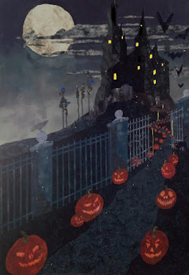
The Halloween quilt is still on my design wall doing nothing. I have to see it every time I go into my sewing room. I am working on some secret projects so it's not like I not doing anything at all, but the Halloween quilt is not moving along. I will be able to post those secret projects in about 3 weeks.
There are a lot of issues I need to resolve with this quilt. The big one is the fence. I have a lot of questions about it.
The easier issues are whether the Moon is a bit too large and whether the windows should be yellow, smaller, and fewer. I was able to sketch this out in an iPad app to see how those changes would look. I think the yellow windows work and smaller and fewer is definitely the way to go. A haunted mansion certainly doesn't need to be illuminated like Vegas.
The fence is not as easy to resolve. I have several questions about it.
- Is the perspective off? If so how? I know some things about perspective and vanishing points, but that is not helping me in this case.
- Is the fence too fancy for the rest of the quilt and is distracting from the house? Do I just need to make the slats more crooked and look more worn out?
- Should I leave the fence out completely or make it more simple and change where it is in the quilt?
I have tried several things as can be seen in the photos below.
Change the path to run more parallel to the fence as is.
Make the fence taller near the bottom left and shrink the size of the largest pumpkin. This is only sketched on my iPad. Maybe I should get rid of the gate.
Eliminate the fence all together. This hurts since with all that work I've grown attached to the fence. On the other hand if it distracts from the house what good is it? But we sure do get attached to things even if they are not good design.
Add in a more simple fence that runs straight across so that I don't have to worry about the perspective. Again this is a sketch.
Add in a fence with some pillars at the opening of the path. Again this is a sketch. The path can certainly be moved to the left a bit as well.
Any thoughts on what I should do to proceed and finally finish this quilt? I know I have posted a lot of ideas in this blog. Now you can see why I have been pretty quiet lately.
Linking to Nina-Marie.
Thanks for reading.


I say leave the fence as is--I like it--adds to the "haunted and dark" look to this piece--and I love that big moon--I think it adds drama to all that darkness--just my thoughts...hang in there, sometimes quilts just do need to marinate a while...
ReplyDeletehugs and stay safe Julierose
The moon is perfect and definitely yes to the yellow, fewer windows. For me, the original is more about the fence and the house is an afterthought. If you want the house to be the focus, you need to put that fence on a different piece and go with the simpler fence. That simple fence also looks great! I totally love this piece and whatever you decide, it will be awesome!
ReplyDeleteLove watching you mull thing over. It’s such a great quilt. I would consider moving the pumpkins in front of the gate so that the line of the pumpkins works better. And the perspective on the gate is off as you said. So I would change the gate. I like the bottom pic because it keeps the fence but allows for the line from the pumpkins. I like the smaller yellow windows and some black thread quilting should knock them back a bit more. This is great piece. Can’t wait to see the finish.
ReplyDeleteI know how second guessing like this but not doing anything about it will haunt you (no pun intended) every time you look at the finished quilt. But I do think you are overthinking the fence in particular. Even with you continuing to insist that the perspective is off, I've never noticed anything off about it. I'm with Julierose, and also agree that the moon is not too big. And while the simpler fence running straight across gives a whole different "perspective" which works, its rusticness does not match in my mind that big castle in the background. Even though we don't see much of its detail, it's not hard to imagine that it would have to have an ornate fence like the original. And unlike the straight across fence, it does help lead the eye toward the castle, much more so than just the path. As for the windows, yes, just a few with lights and I'd go with a yellow that wasn't quite that bright to balance with the other colors in the quilt.
ReplyDelete