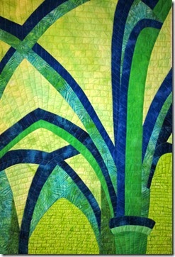
Our finished quilts were due yesterday. I finished mine except for binding or facing it. This time the photo shows the real colors.
I wasn’t sure if EB was going to like the quilting since she seems to like more simple and not over done quilting. I am not saying that the “brick” pattern is over doing it, but not sure that it would be something she would like.
Here is the feedback:
I do like the "brick" quilting on this one, it gives a great texture to the piece and contrasts well with the smoothly stretching out arches shapes...I think it works better with the greater uniformity in the colors (than in the blocked out version). There's plenty to look at to hold one's interest, but nothing jarring or out of place - and a nice sense of dimension with the rounded shape on the pillar on the right - like that!
Student 12 wrote: " It is 25 in by 38 in. I thought that this month's lesson was a challenge (as well it should be) so I made a larger quilt. . .I really had a hard time with the fabrics between the arches. I switched it out several times especially the areas below the bottom arches that looked too beige in my blocked version. Sometimes fabric choices are easy and sometimes they are hard. I decided to quilt this with irregular stone/block shapes and used the photo to help me with size and orientation of stones/blocks."
Well it all looked good in the end!!! Very nice.
Well I am glad that this one is finished and I did not throw it out the window after all. One of these months I keep hoping that I am going to make a quilt that EB really, really likes, but I guess I will take the comments like “very nice” because that is better than her saying she hates it. Conclusion…I still have a lot of growth ahead of me.
It still reminds me of the line from Pride and Prejudice about praise.
Now to bind or face is the next question. At this point I was actually thinking of binding it in a dark blue or green. It seems like it needs something to frame or finish the edges. What do you think?
And I have to think about a title. So far this is all I have:
Tempus Fugit (means time passes in Latin)
Across the Years
World of Stone
Any ideas? Sometimes titles are hard for me.
Now to start to think about May’s lesson that just came out today. This time it is a landscape, but if you know EB you know that does not mean the literal translation of a landscape. We are supposed to subtract, rearrange and add in creating this landscape. That means taking it down to its simplest shapes and rearranging them to make a pleasing composition, and then add something. I am leaning toward doing something with fog. I have always been fascinated with fog. Or I might do something with a photo of my dad’s pond. Have to think about it for a few days.
Linking to Off the Wall Fridays over at Nina-Maries blog.
http://ninamariesayre.blogspot.com/
Thanks for stopping by.
Chris


I like the way you quilted this one. It accentuated the space between the arches. I would hate to put my quilts up for the critique like this.
ReplyDeleteCongratulations, Chris -- it looks wonderful. The 'brick' quilting design is just right. Binding? I don't know...I'm "into" facings these days...
ReplyDeleteI think a blue binding will add a design element, that is not arched, and will detract from your lines. The brick work is awesome, it gives it a sense of solidness with the soaring arches, also adds scale to the design, to let you know the arches are huge cathedral like. High praise from me!!
ReplyDeleteOh my, I am SO impressed with how this turned out. The quilting is absolutely brilliant! I couldn't think beyond echoing those curved arches but the brickwork/stone is so much better it helps make sense of what the viewer is seeing. Your replacement fabric works well too. Well done!
ReplyDeleteAs much as I default to binding (see my last quilt!) this one does feel like a binding would detract and I would probably suggest just to face it. I'm taking it into Paint Shop Pro to check on that. That's how I determined my last one looked better with a bit of a frame around it.
As for a name? What's the name of the cathedral you used as your reference - you could incorporate that somehow? Although, I have to say, World of Stone ain't bad.