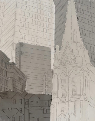
Thanks for all those that voted last week on which value study they liked best. As in what usually happens is that there was no consensus. So I had to go with my gut instinct and the feedback from the teacher. Also what fabrics were in my stash also determined which one to pick.
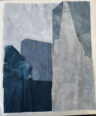
I had some hand dyed and snow dyed blue grays. That’s what I went with.
For the cathedral piece I chose value study 3.
Here are the fabrics cut oversized as well as the sketch overlayed over the fabrics so you can see what’s what.
For the streetcar piece I went with value study 4. That’s the one the
teacher thought had the most movement and was the most dynamic. That
choice was also based on what red snow dyed fabric I had for the
streetcar.
I sent these off to my teacher for feedback and I just
heard back. The cathedral is good to go. She noted that my streetcar is
darker than in the value study sketch. I did try a lighter red/pink, but
I’m not sure I wanted a pink streetcar.
Here’s the lighter streetcar. I turned the image grayscale and it does match the value sketch better, but is a pink streetcar better? Another decision to make…
Thanks for reading. A pink or red streetcar????
Linking to Nina-Marie.


I think I'd go with the red street-car -- though I confess I've never seen one that colour! The buildings, by the way, are amazing!
ReplyDeleteIt may be a value study to start, but now you are making it real. Definitely red streetcar for me!!
ReplyDelete