Friday, November 21, 2014

Still on the wall


My tumbling blocks is still on the wall. I had to learn to do a good y-seam to sew the individual blocks together. The blocks turned out pretty good. Now I am in the process of sewing the rows together. That is a bit trickier since you have lots of seams that come together in certain spots. This is what I have so far.


My daughter wants this quilt since she loves it and she provided feedback on it. See my last blog about my feedback from her and from EB.


origidea

I am thinking of mounting this on a canvas. I have never done that before and thought it might be interesting to do. It might look something like this. I just pasted my photo over a photo of a black painted canvas. I might do dark blue instead of black. What do you think?


Thanks for reading. Linking to Nina-Marie.

Chris

Sunday, November 16, 2014

What to make of a critique

I was really taken by surprise by EB’s critique of my submitted quilts.

Here’s what EB said:

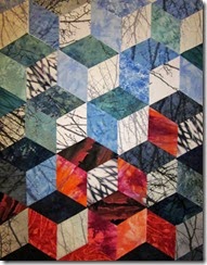
I like them both...the non traditional one practically dissolves when the printed blocks come together the "traditional" one isn't exactly tradition - there are anomalies - very slight! - which do make you think  and break up the rigidity of the traditional patterns.  I like the top one because it's more open at the top and there's more "air" but the fact that the light/medium/dark face pattern doesn't quite work is a little more uncomfortable.  The bottom  one is more comfortable in that way but the dark ones feel very strong and heavy..

I wonder if you followed the traditional pattern with one face for each value...but then reduced the weight of each value as the blocks climbed??

Beautiful crisp pattern which gives a great sense of a winter's day and the orange of the banners contrasting with the crisp white/grey/black of the trees!

So I took this to heart and revised the traditional one and submitted this which I like. In fact I like all three of them.

Here’s what she said about the revision:

wow that was fast...I do like the longer proportions and the sense of rhythm here...and the way the color comes in...it's a really great interpretation of the photograph with a traditional pattern!    Nice one!


I also consulted my daughter who has been incredibly helpful when it come to my quilts. After seeing the first two quilts my daughter said:

... and I LOVE the deconstructed version of the quilt. That looks like it should have a frame around it and be hung in an art gallery somewhere! I like how the colors flow into each other vs. the traditional one where they're all scattered around.

After seeing the resubmission she said:

I think I actually still like the original deconstructed one better. I honestly wouldn't change that arrangement at all. I will admit that the new one looks more quilt-like and the deconstructed one was more art-like. I actually like how some of the blocks in the deconstructed one have very little contrast with each other and some are more pronounced. There is also kind of an optical illusion where you can't tell where some of the blocks are going which I also like. The new one is much more uniform, but I prefer the variations in the original. It actually looks like a lot of graphic design work I've seen.

So now I have decided to make the deconstructed one. The comments on my last blog also support that decision. Plus I need to think about what was my intent in this quilt? I wanted some of the blocks to stand out and some to be ambiguous. I think that is achieved more with the deconstructed version. Plus my daughter likes that one more and she will probably have this one on her wall.

How could I not trust a face like this? Thanks, Kelsey!

Kelsey[3]

So what do you do with a critique?

Usually I take it to heart and follow it exactly and make all the changes it suggests. This time, however, I am going to follow my heart and make the one I want to make.  Sorry, E. What surprised me the most about her critiques is that she likes the ones that read as a quilt more than the deconstructed one which read more as graphic art. My husband who likes traditional quilts liked the deconstructed one the least.

Thanks for reading.

Chris

Saturday, November 15, 2014

Making progress!

Can’t believe I was able to get blocked quilts submitted to EB already! I guess you would be able to figure that out if you saw my sewing room (I mean quilt studio) right now. Here is a photo of just one little corner of it near my cutting table. The rest is a mess as well.

  • I printed trees on some fabrics with my printer. That is always fun as you worry that the fabric is going to jam the printer.
  • I used used some flour resist crackle fabric that looked like trees.
  • I used some black and white shibori.
  • I used some commercial fabrics that had subtle trees on it.
  • I used some oranges to be the orange gates.
  • I finally used a diamond cutting ruler that I bought at least 5 years ago,,,,I knew I would use it some day!

Here is what I have submitted to E.


The first one is traditional tumbling blocks. I am wondering if I should add another row of blocks so it is longer than it is wide. Right now it will finish about 19 inches wide before I add facing or binding. Not sure what to do since I might be tempted to bind it this time.


The second one is more deconstructed and is more like the image that was fragmented from the photo. It has more lost and found edges since the traditional dark, medium, and light for each block is ignored. It is longer than it is wide.


What do you think?

Won’t be getting feedback from E before the 21st since she is away. Meanwhile I will clean the disaster in my sewing rooom.

Thanks for reading.

Chris

Friday, November 14, 2014

A lot of work to do!

For our November lesson EB gave us 3 photos to work with. We had to choose one and come up with a great design. I decided to pick the one of the Christo gates that were in Central Park. I was not thrilled with her photo so I used one that we had taken when we saw them.

Here is the photo.

tryagain

I have an app on my ipad called Fragment that fragments a photo. I thought the app might be handy at some time to help create a design. Here are my fragmented images.

IMG_0619

IMG_0620


I have always wanted to do a tumbling block quilt. I do realize that it needs some work in terms of the light, medium, and dark faces of the blocks. The Fragment app does not create blocks over the entire image so some changes are needed there as well. Personally I like the grid one better, but not so easy to pull off in a short time frame.

EB wants our sketches in black and white so I changed these to gray scale in Photoshop and submitted them. Her comments were almost as expected.

Nov_CS_sketch1

Nov_CS_sketch2


So now I have the challenge of finding fabrics to work for this tumbling block design. To tell you the truth I am weary of trying to pull off a quilt each month, but I knew E worked you hard when you take one of her classes. And that is what I signed on for.  At least this is the last one.  I need a break from making art quilts and plan on making some traditional quilts. I want to use up fabrics and we need some larger bed sized quilts. I think it will be a pleasant diversion when I start retirement. That by the way is only 4 weeks away!!!!

Linking to Nina-Marie.

Thanks for reading. I am off to play in EQ for a while to establish in my mind what I am going to do with this.

Chris

Sunday, November 2, 2014

“Blown Opportunity”

I have been away so have not had a chance to post my finished wind turbine quilt or post my feedback from EB. The title “Blown Opportunity” came from my husband.

“This worked out really well...I love the way you've got the light catching the edges of the blades...the cool colors (enhanced by the touches of red) definitely emphasizes the point that wind power will heat the planet up less than coal powered plants!


The diagonals are very dynamic also and help to create the movement inherent in the subject.  Diagonals are strong shapes to use in a design.

And now I'm worrying about what you'll do next month because it won't be so easy to translate the assignment into a power/pollution issue!!!   it's going to be interesting.....”


Here is my coal stack energy quilt (“ A New Dawn?”) in contrast to the new wind turbine quilt (“Blown Opportunity’). They have a very different feel due to the different dominant color. Color sure makes a difference. The dominant color of red creates a different mood than the dominant colors of green and blue.

An E may be right about not being able to do an energy quilt for November. She gave us 3 photos to choose from for our inspiration for this month’s quilt. And none of them are energy related. Although I am tempted to try to incorporate energy just to prove E wrong! At this point I am not even sure of which photo I will work from let alone what I will do with it. Time to do some thinking which is always my first step in making a quilt….lots and lots of thinking.

Thanks for reading.

Chris